Friday, December 2, 2022

CONCATenated Calculated Fields: A"\n"other idea


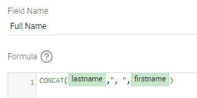
CONCAT is a fabulous function in Looker Studio, since it allows you to combine information efficiently in a calculated field. A simple example: if you have lastname and firstname fields in your data, you can combine them to create a Full Name calculated field as shown here (example output would be Smith, John.)

However, I recently learned that "\n" (newline escape character) can also be incorporated into a CONCAT field to include a line break in the resulting calculated field. This can be SUPER useful if you're trying to cut down on the width of a table so it fits better on your dashboard.

Originally, this table had one column for each field, so the table needed to be relatively wide.

After some creative CONCAT, including "\n", the table takes up much less horizontal real estate. Note that the table needs to have text wrap turned on in order for this to work.


The drop-down filters elsewhere in this report can still be used to filter records based on the individual fields (like Department), although one caveat is that the table can't no longer be sorted by Department with this approach (not a big deal in this case).

In this example, the (chart-level) calculated fields looked like this:


This approach also works well for the Tooltip on a bubble map, allowing you to bring lots of information into your Tooltip without the rollover label becoming too lengthy and running off the side of the report. (Side note: I have not been successful using this approach on a scatter plot, however.)

If you have additional ideas on how to use this type of line break in Looker Studio, let me know!

Wednesday, October 12, 2022

Look Out! It's Looker Studio! What does this mean for K-12 users?


Yesterday at Google Next 2022, the announcement was made that Google Data Studio has been rebranded as Looker Studio, which was a big surprise to many, especially if you found out by noticing a new name on the interface! 

For those that aren't familiar with Looker, it is a business intelligence software and big data analytics platform which was acquired by Google in 2020. The rebranding of Data Studio as Looker Studio is good news as it shows a continued dedication by Google to provide robust tools for data management and analytics. Yesterday's conference was also filled with exciting conversations about machine learning and artificial intelligence, to continue to allow organizations to gain valuable insights from their data. 

The important thing for those in K-12 education to know is that Looker Studio is still free, and you can continue to use this awesome tool to create and view reports just as you always have. Looker Studio Pro ($) will provide improved asset management, new team collaboration capabilities, and access to technical support.

There's a lot to unpack after yesterday's announcement, and I'm sure there will be more developments in the coming months. But don't freak out! The main thing to know right now is that nothing has really changed for K-12 users of Data Studio, except a name and logo...and the knowledge that Google is continuing to support and innovate tools for creating data-driven experiences. So LOOK to the future and go forth and create!

P.S. While I know this blog is not the most active any more, I don't plan to change the URL or blog name to go with this name change, and probably won't go crazy updating old posts and things. Feel free to follow me on Twitter @tiltondata which is where I'm more active these days!

Tuesday, August 9, 2022

Report Passwords for Custom Data Delivery

Here's a fun way to use Parameters in Data Studio! You can use them to set up a variety of passwords for your Data Studio report, and even customize the data delivery for different passwords. 

Check out this example for more information. 


Monday, May 17, 2021

Calculated Fields: Figuring it out!


Calculated fields are a critical feature of Data Studio, and allow you to transform your data in a number of different ways. If you're at all familiar with functions and formulas in spreadsheets, you're more than halfway there to understanding calculated fields in Data Studio.

As of right now, Google Data Studio supports 82 different functions for calculated fields in seven different categories: 

  • Aggregation (such as AVG to calculate an average)
  • Arithmetic (such as ABS to return the absolute value of a number)
  • Conditional (such as IF to return values based on conditional statements)
  • Date (such as MONTH to return just the month of a date field)
  • Geo (such as TOCITY to return a city name)
  • Text (such as CONCAT to combine/concatenate text)
  • Miscellaneous (such as HYPERLINK to create a clickable hyperlink in a table)

Calculated fields can be created either at the data source or the chart level in a Data Studio report. Data source calculated fields can be used over and over throughout any report that uses that data source, whereas chart-level calculated fields are created for use in a single graph, table, filter control or other element. more info

To create a data source calculated field, go to Resource > Manage added data sources, choose Edit for the data source to which you want to add the field, and then click + Add a Field in the upper right corner of the page.

To create a chart-specific calculated field in say, a selected table, look in the Data pane of the table's properties panel on the right, and click +Add dimension or +Add metric (depending on the kind of field you want to create.)

In both cases, you'll then need to give the field a name and then write a formula. Here are examples of calculated fields using two of my favorite functions:

  • Combining: Suppose your data source has fields for firstname and lastname, but you want to have a field that just gives a student's full name. You could use the CONCAT function to create a new field called Full Name. (Note that the example includes a comma and space between the two names.)


  • Transforming: Suppose you have a boolean field called IEP that is a 1 if a student has an IEP, and a 0 if they don't have an IEP, but you want the information to display more descriptively than just 0 or 1. You could use a CASE statement to create a new field called IEP Status.
        
  • You could also use the IF function to do something similar.

For my spreadsheet friends: Please note that you don't need to type "=" before using any of these functions, like you do in Sheets or Excel (this took me some time to get used to!)

You might be asking, "If my data source is a Google Sheet, why wouldn't I just create these new fields as columns in my Sheet?" This is definitely another option, however, using calculated fields means you can do all the work on the Data Studio end without having to refresh the data source every time you add a new field, or "fill" Sheet formulas every time new rows are added to the spreadsheet.

Google has a simple tutorial to walk you through creating a few different types of calculated fields, if you want to try it out. 

Friday, February 12, 2021

Google Forms + Data Studio = A Match Made In Heaven!

Since it's almost Valentine's Day, I thought I'd highlight one of my favorite couples - Google Forms and Google Data Studio! 

Google Form data (saved in a Google Sheet) is a GREAT starting point for educators looking to get started creating a Google Data Studio report. Why? One main reason is that the structure of the data works well as a Data Studio data source, since it has just a single header row, no merged cells, no blank rows, and consistency in field values.


Here are a few tips for developing Google Forms to use with Data Studio:

  • Use very short questions. Try using just 1-2 words in the Google Forms question field, then and putting the full details of the question in the description. These questions become your column headers in Sheets and thus your field names in Data Studio, and this makes them much more manageable.
  • Avoid "Check all that apply" type questions. Try using a multiple choice grid type question (with yes/no answers) instead. This makes the data more compatible with filtering in Data Studio.
  • Build a sort order into your responses. If the responses to a question have a particular order (like Daily, Weekly, Monthly), try including a sort order in the responses (1-Daily, 2-Weekly, 3-Monthly) so that when you sort in Data Studio they sort correctly. (Yes, you could do this with a calculated field in GDS too, but why make things harder if you don't have to?) Linear scale questions are a good option for this too, especially if you want to report on the average response number.
  • Build your report first based on sample data. I will often build my report BEFORE sending out the Form, using the Form Responses tab with some rows of sample data (I usually try to add enough sample data that all possible answers are in the data set for each question.). I then remove my sample data once real data starts coming in.
  • Take advantage of "live" updating. If you've built your Data Studio report, and the data continues to come in via the Form, the report will continue to update (automatically every 15 minutes). This is great for "leaderboard" type reports when you've built out the report ahead of time (see previous bullet)
  • Capture email addresses. If your data source contains email addresses, you can use the Filter by Email feature to create customized reports. Or, you can use the email addresses as a unique identifier to pull in additional information on top of what's collected in the Form.
Here are some of my favorite examples of Data Studio projects that use Google Form data:

Do you have any other great examples? Please feel free to submit them to the K-12 Data Studio Report Collection!

Oh, and Happy Valentine's Day! ♥

Monday, December 14, 2020

Dynamic Dimension Parameters!

Have you ever wanted the user to have the ability to select which fields are utilized in a Data Studio chart? For example, suppose you wanted to look at the breakdown of a school's population by various dimensions, such as Special Education status. Gender, ELL status, High Needs status, Economically Disadvantaged status, and Title I status. In the past, you would have needed to create multiple charts, one for each dimension...making for a very busy report!

Parameters are a relatively new feature of Data Studio, and have a wide variety of uses. Essentially, they act like variables to make your report even more flexible and interactive. Here, I'm going to walk you through how parameters can be used to choose the dimension for a pie chart in a Data Studio report, allowing all the options above to be displayed in the space of a single chart. Take a look at the following simple example to see how this operates:


Cool, right? Here's how it's done.

The data source Sheet contains a list of students, plus columns for various demographics: Gender, Special Education Status, High Needs Status, Economically Disadvantaged Status, English Learner Status, and Title I Status.

I created a Parameter called Demographics (Resource menu, Manage added data sources, Edit, Add Parameter) and gave it a list of values with the same names as my fields.

Note that parameters appear as purple in the field list, whereas fields appear green.


Then, I created a calculated field (which I also called Demographics) which contained the parameter. I did this because I want to use it in a CASE statement, so it needs to be a field rather than a parameter.

Finally, I created a calculated field called Demographics Selection using the following CASE statement: 


To create the simple report linked above, I created a filter control (Fixed-size list) based on the Demographics parameter, and also a pie chart where Demographics Selection is the dimension and Record Count is the metric.

Interested in learning more about using parameters within Data Studio to dynamically change dimensions? Check out the following blog posts which are what helped me figure this out. How can you imagine using this feature? Let me know!

Resources:


Monday, November 23, 2020

Happy Thankgiving!

There is always something to be #thankful for! Share your thanks with this fun #Thanksgiving dashboard using #GoogleDataStudio and #GoogleForms. 


Happy Thanksgiving!