Check out this example for more information.
Data tools and resources to support K-12 teaching and learning, with a focus on Looker Studio (formerly known as Google Data Studio).
Tuesday, August 9, 2022
Report Passwords for Custom Data Delivery
Friday, February 12, 2021
Google Forms + Data Studio = A Match Made In Heaven!
Here are a few tips for developing Google Forms to use with Data Studio:
- Use very short questions. Try using just 1-2 words in the Google Forms question field, then and putting the full details of the question in the description. These questions become your column headers in Sheets and thus your field names in Data Studio, and this makes them much more manageable.
- Avoid "Check all that apply" type questions. Try using a multiple choice grid type question (with yes/no answers) instead. This makes the data more compatible with filtering in Data Studio.
- Build a sort order into your responses. If the responses to a question have a particular order (like Daily, Weekly, Monthly), try including a sort order in the responses (1-Daily, 2-Weekly, 3-Monthly) so that when you sort in Data Studio they sort correctly. (Yes, you could do this with a calculated field in GDS too, but why make things harder if you don't have to?) Linear scale questions are a good option for this too, especially if you want to report on the average response number.
- Build your report first based on sample data. I will often build my report BEFORE sending out the Form, using the Form Responses tab with some rows of sample data (I usually try to add enough sample data that all possible answers are in the data set for each question.). I then remove my sample data once real data starts coming in.
- Take advantage of "live" updating. If you've built your Data Studio report, and the data continues to come in via the Form, the report will continue to update (automatically every 15 minutes). This is great for "leaderboard" type reports when you've built out the report ahead of time (see previous bullet)
- Capture email addresses. If your data source contains email addresses, you can use the Filter by Email feature to create customized reports. Or, you can use the email addresses as a unique identifier to pull in additional information on top of what's collected in the Form.
Surveys & Voting
Resource Collections
Student Work
Monday, December 14, 2020
Dynamic Dimension Parameters!
Have you ever wanted the user to have the ability to select which fields are utilized in a Data Studio chart? For example, suppose you wanted to look at the breakdown of a school's population by various dimensions, such as Special Education status. Gender, ELL status, High Needs status, Economically Disadvantaged status, and Title I status. In the past, you would have needed to create multiple charts, one for each dimension...making for a very busy report!
Parameters are a relatively new feature of Data Studio, and have a wide variety of uses. Essentially, they act like variables to make your report even more flexible and interactive. Here, I'm going to walk you through how parameters can be used to choose the dimension for a pie chart in a Data Studio report, allowing all the options above to be displayed in the space of a single chart. Take a look at the following simple example to see how this operates:
The data source Sheet contains a list of students, plus columns for various demographics: Gender, Special Education Status, High Needs Status, Economically Disadvantaged Status, English Learner Status, and Title I Status.
I created a Parameter called Demographics (Resource menu, Manage added data sources, Edit, Add Parameter) and gave it a list of values with the same names as my fields.
Note that parameters appear as purple in the field list, whereas fields appear green.
- Dynamic Change of Dimension using Google Data Studio Parameter
by Mimoune Djouallah (@mim_djo) - Google Data Studio secondary dimension like inside Google Analytics
by Mehdi Oudjida (@wissi_analytics) - Use Parameters to change Column Dimensions in Google Data Studio
by Michael Howe-Ely (@michaelhoweely)
Monday, November 23, 2020
Happy Thankgiving!
There is always something to be #thankful for! Share your thanks with this fun #Thanksgiving dashboard using #GoogleDataStudio and #GoogleForms.
Happy Thanksgiving!
Saturday, August 29, 2020
Christmas in August?!?
Monday, July 13, 2020
Simple Row-Level Display Control
We've seen a number of Data Studio report examples that display information that might be collected via a Google Form. But what if you don't want the Form information to display in your Data Studio report immediately? What if it needs to be "approved" first, or what if you want to be able to show/hide different entries from your data source at different times?
Some examples of reports that could benefit from this functionality might be:
- a staff directory report (might want to show only current staff but keep other names in the data source)
- a digital tools learning organizer (where staff are submitting ideas via Form but the instructional technology lead is "approving" them for inclusion in a shared list)
- a remote learning project sharing report (where students are submitting images via Form but the teacher needs to mark them "approved" in order to include them in a public listing)
I'll use the Staff Directory report as an example. To control which entries from my Sheet data source are displayed in my report, I needed to do two things.
Step 1: I added a column called "Include?" to my Google Sheet data source, and I marked the rows I want to include with "y". In this case, I didn't include a "y" next to Al Banks, Director of Support, although his data is still included in my source Sheet.
Step 2: I added a filter to the report to specify that only rows where "Include?" is equal to "y" should be included in my report. I did this from File > Report Settings > Add a Filter, which will put the filter on the entire report (alternatively, the filter could instead be added to individual report elements like tables and filter controls.)
You'll notice that now the report does not include Al Banks, Director of Support, even though his information is included in the data source, since this filter has been applied. If I wanted to include him in the list, I would simply add a "y" in the "Include?" column in the data source, and Voila! He'll be back in the report.
This is a very simple, but very useful, way to control the data that is displayed in a report at the row level on the back end. BTW, I use this simple approach for the entries that are included in the K-12 Data Studio Report Collection, which allows me to approve form-submitted entries before they are included.
Wednesday, June 17, 2020
Fun with Filters!
Data Studio Help: Filter Controls
Chart Interaction Filters allow report authors to turn charts into interactive filters. For example, if your report contained a pie chart, this could be made into an interactive filter allowing the user to click a section of the pie chart to filter the information in the report.
Data Studio Help: Chart Interaction Filters
Treemap as filter menu from Mehdi Oudjida
Data Studio Help: About Filters
Filter by Email is a relatively new feature of Data Studio that uses the user's Google account to display a custom data set based on an Email field in the data source.
Data Studio Help: Filter by email address
I created this sample report (also linked to the image above) to show examples of all the elements discussed here (except Filter by Email), so you can see how these different filters work. Obviously, you wouldn't use them all in one report for the same dimension, so this report is really just for fun.
Let me know.. how do YOU like to filter?
Thursday, June 4, 2020
Visualizing Plans for the Class of 2020
Here's a very simple template for any high school who wishes to display the plans of their 2020 graduates in a fun visual map format. Clicking on a row in the table will zoom in on the Google map to show the location, and the user can even use the "Pegman" to take a look around at Street View. Clicking the row again will bring the user back to the entire list/map.
To make your own version of this report, first create a simple Google Sheet with a single column with a header of "List." This column should have a single entry related to each student in the class, although the list would not include student names. So, for example, if two students are attending Cape Cod Community College, then "Cape Cod Community College" would appear twice in the first column of the spreadsheet. It doesn't matter what order the list is in. Most high school guidance departments would be able to export this list from Naviance or other college and career platform.
After the Sheet is put together, you can make a copy of the report by clicking Use Template in the upper right corner of the report link. You can then connect your new Sheet as the data source for your copy of the report. If you need additional information about how to connect a report to a data source, please refer to these instructions.
You will want to check that the List field is of the type Geo > Address. You can check this through the Resource menu > Manage added data sources > Edit and check the Type column for the List field.
A few notes: Some Sheet entries may need to be tweaked to display correctly. For example, there may be multiple colleges with the same name (like Trinity College) so you may need to add a city/state in order for it to display correctly. Non-location generic entries such as "2yr college", "Employment," etc. will not display on the map but will display in the list.
You can then customize the colors, logos, etc. of the report to make it your own. (Tip: Try Extract Theme from Image using your school's logo!) I would love to see what you come up with - and congratulations to the class of 2020!
Wednesday, May 27, 2020
Create a Student Dropbox and Work Log with Google Tools
- A student-specific work log, which allows a student to view only his or her responses and submitted work, like a portfolio of sorts.
- A teacher- or class-specific work log, which allows the teacher to look at responses/work by student OR by assignment.
- A public display of student work, which might display images and descriptions, either with or without student names.
Friday, May 15, 2020
Google Maps in Data Studio
Wednesday, April 29, 2020
Do You Hear the Angels Sing?
As promised, I am sharing the recorded webinar, the 'slide deck' (actually a GDS report), and the list of getting started resources, for those who would like to review the materials or share with colleagues. Additional resources are regularly posted here on my blog as well as on Twitter @tiltondata. I am also available to provide consulting services in the area of Data Studio professional development as well as customized dashboard development.
Please feel free to reach out if you have follow-up questions, resources to share, ideas for new visualization tools, or suggestions for future blog posts. Thank you and stay well!
Tuesday, April 21, 2020
Tips for Structuring Your GDS Data Source in Google Sheets
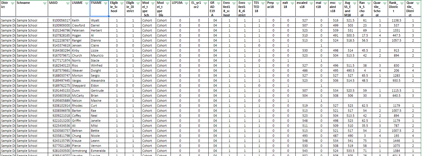
Here's a simple example. Schools often store data within a structure like the one below, because it makes more sense when we are looking at it in a spreadsheet. We can look at and/or enter student scores over time, and we can see all of a single student's data in one row. Logical, right?
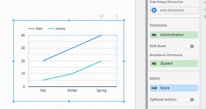
However, this type of structure may not allow us to display the data in a desired format, because you essentially have three sets of metrics for each student. Restructuring the data so that we have a dimension (Administration) and a metric (Score) can help, as in the example below.
- If you're concerned your existing data needs some restructuring in order to work well with Data Studio, you can try taking a look at Ben Collins' approach for 'unpivoting' data in Sheets.
- Life is easier if your data source Sheet has a single header row in the first row of the Sheet. Merged cells or multi-row headers will need cleanup or workarounds in order to use them in Data Studio.
- Avoid summary rows, extra text on the sheet, and blank rows or columns (blank columns will not be brought as part of a data source even if they have a header).
- Cells should contain a single value where possible. I try to avoid 'check all that apply' type questions in a Google Form for this reason. I found this resource on CATA questions from Sheila B. Robinson very helpful.
- If you will want to do any sort of data blending with multiple sources, make sure your Sheet includes a column with some sort of unique identifier, such as student ID number.
Friday, April 17, 2020
Webinar: Getting Started with Google Data Studio in K-12 Education
With all of my workshops and conference presentations cancelled this spring I am really missing being able to share the joy of Google Data Studio with others! I am offering a free webinar (two date/time options) entitled "Getting Started with Google Data Studio in K-12 Education" which will be very similar to overview sessions I have presented at recent conferences. Feel free to share with colleagues too!------------------------------
Google Data Studio, a free data visualization tool designed for business, can be used by educators to turn unwieldy data into visual and interactive dashboards. A variety of examples related to assessment, demographic, attendance, accountability, and other types of data will be presented. An overview of the steps to get started using this tool and create a simple dashboard will be shared. While this is not intended to be a hands-on session, some "getting started" resources will be provided so that participants can try out the tool on their own after the session.
Thursday, April 23, 2020, 10:00 am EST - 11:00 am EST
Friday, April 24, 2020, 11:00 am EST - 12:00 pm EST
Tuesday, April 28, 2020, 4:00 pm EST - 5:00 pm EST
Instructor: Laura Tilton (http://tiltondata.blogspot.com, @tiltondata on Twitter)
Cost: Free!
Registration: https://forms.gle/
The session will be held via Zoom and the link will be emailed to registrants the day before the session. If you have any questions please contact me at tiltondata@gmail.com.
Thursday, April 16, 2020
Collecting and Viewing Student Check-In Data
If a school needed to 'take attendance' during remote learning, they might do so with a "question of the day" setup like this one that I recently created. It could also be used as just a fun daily check-in to build community or engage students. This report embeds the Google Form, and an automatically updated Question of the Day (from a Google Sheet) right into the report, so it's a one stop shop for collecting and displaying information from students.
When used with the Filter by Email feature of Data Studio, the results of a student survey could be used to display information back to a student, similar to the way Matt Heusmann, ESU 6 in Nebraska, used three different forms (check-in, journaling, and exit ticket) to populate this sample Data Studio Report.
You might also choose to check in on how students are feeling, which you could do with a tool similar to the Personality Quiz example created by Michael Howe-Ely.
Other data collected and visualized during remote learning might be usage data from a district's Learning Management System or family surveys providing feedback on the remote learning process. Jordan Benedict has an interesting blog article on 4 Types of Data to Collect During Distance Learning...what information are you collecting? Do you have any other valuable resources on this topic? Please share here on the blog, connect with me on Twitter @tiltondata, or drop me a line at tiltondata@gmail.com. Hope you are well and staying safe and sane!
Thursday, February 20, 2020
A Whole New World for Google Form Data
While Google Forms does have its own basic reporting tools (bar charts and pie graphs), if we attach the Google Sheet results of a Google Form to Google Data Studio, we can do so much more with the data! Not only in terms of visualizing the data, but also in terms of sharing the data. I want to present two examples that illustrate how amazing this can be.
First, an example from Craig Sheil who used Data Studio to visualize the results of a student survey about social media use at Bedford (NH) High School. In previous years, the results of the survey were shared with students via Google Slides (using screen shots of the graphs from the Form results). This year, the results were compiled into a Data Studio report, including some interactive filters, allowing for a dynamic exploration of the data.
The second example is based on work by Elissa Malespina who created a Google Data Studio report of student reading log data back in October of 2018 (while at Somerville Middle School in NJ). When I saw her example, I was really excited to see Data Studio being used with students (and amazed at how ahead of the times Elissa was!). However, I knew that some of the Data Studio updates since 2018 could really enhance what she had already started. I reached out and she agreed to share the (anonymized) data with me, so that I could update her report with some new features.
Thursday, January 23, 2020
In-Field and Out-of-Field Educator Designation Report
This information was delivered in an Excel spreadsheet to the DESE Security Portal > Drop Box Central > EPIMS File Exchange, and has the file name like In_field_data_2019_xxxxxxxx.xls. If you convert this file to a Google Sheet, you can use it as the data source for a simple report I've created to explore this data.
This report uses a pivot table as a filter, so that you can click anywhere in the summary table to filter the data. In the example below, I've clicked the "N" column for Sample1 School, and the list below updates to show the 6 educators who are Out-of-Field and why.
Feel free to check out the report template (which contains sample data), and follow the instructions to connect your own Google Sheet as the data source to create your own copy of the report. As always, please make sure the link sharing settings on your reports and data sources are are turned off, so that if you need to share the file you are sharing only with designated, authorized individuals.
--------------------------------------------------------
Upcoming Google Data Studio workshops:
2/11/2020 @ Southeastern Massachusetts Educational Collaborative (Dartmouth, MA)
3/31/2020 @ The Education Cooperative (Walpole, MA)
Upcoming Conference presentations:
2/28/2020 @ METAA CTO Clinic (Milford, MA)
3/6/2020 @ MASCD and MassCUE Leadership Conference (Worcester, MA)
3/27/2020 @ Medfield Design Your Learning Day (Medfield, MA)
Tuesday, January 14, 2020
Simple School or District Staff Directory Tool
Want your own version of this directory? This is a great project for anyone new to Google Data Studio.
First, create a data source by pulling the following fields from the Staff listing in your SIS and placing them in a Google Sheet (you don't need to share it). Make sure the column headers match this list exactly (feel free to make a copy of my sample data source to use as a template):
- First
- Last
- Ext
- Room
- Position
- Department
- School
Finally, you need to decide who you would like to access your new report. Use the "Share" button to share as view-only with specific individuals, with everyone in your GSuite domain, or with anyone with the link. If this is a district or school directory, I would suggest sharing it with the domain, so that only members of your school or district will have access to the directory when they are logged into their school accounts.
As the editor of the report, you can then modify the color scheme to match your district's colors, add a logo or text, or make other modifications as desired. You can also embed the report into a web page for easy access.
--------------------------------------------------------
Upcoming Google Data Studio workshops:
- 2/11/2020 @ Southeastern Massachusetts Educational Collaborative (Dartmouth, MA)
- 3/31/2020 @ The Education Cooperative (Walpole, MA) not yet open for registration
- 2/28/2020 @ METAA CTO Clinic (Milford, MA)
- 3/27/2020 @ Medfield Design Your Learning Day (Medfield, MA)
Friday, November 22, 2019
Google Data Studio Report Catalog
Please visit http://bit.ly/tiltondata and check it out! Please feel free to provide any feedback, or ideas for new reports and visualizations. You can find me on Twitter sharing additional resources @tiltondata.
Friday, November 8, 2019
School Attending Children Report - updated with 2019 data!
DESE makes this data available online but it is challenging to look at the information longitudinally to understand how populations have changed over time. Google Data Studio can help! Click the image below to explore the data for any Massachusetts town.
.png)