Tuesday, April 21, 2020

Tips for Structuring Your GDS Data Source in Google Sheets

When educators are first getting started with Google Data Studio, one of the most challenging things to learn is the best way to structure a data source (for example, in Sheets) so that it works well with Data Studio. The problem is that the way people tend to USE spreadsheets can be very different than the way Data Studio prefers them to be set up in order to visualize the data effectively.

Here's a simple example. Schools often store data within a structure like the one below, because it makes more sense when we are looking at it in a spreadsheet. We can look at and/or enter student scores over time, and we can see all of a single student's data in one row. Logical, right?



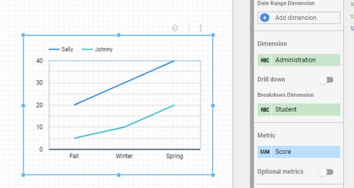
However, this type of structure may not allow us to display the data in a desired format, because you essentially have three sets of metrics for each student. Restructuring the data so that we have a dimension (Administration) and a metric (Score) can help, as in the example below.


This allows us to graph the data in a useful way:

I see a lot of Sheets where there is one tab (or Sheet) per school, grade level, classroom, etc. Data Studio wants to see your data in a single Sheet, with columns to identify school, grade level, classroom, etc. which will then allow you to filter the data by those criteria. You can use an IMPORTRANGE or QUERY formula to bring data together from multiple tabs or Sheets. 


A few other tips for structuring data sources:
  • If you're concerned your existing data needs some restructuring in order to work well with Data Studio, you can try taking a look at Ben Collins' approach for 'unpivoting' data in Sheets. 
  • Life is easier if your data source Sheet has a single header row in the first row of the Sheet. Merged cells or multi-row headers will need cleanup or workarounds in order to use them in Data Studio. 
  • Avoid summary rows, extra text on the sheet, and blank rows or columns (blank columns will not be brought as part of a data source even if they have a header). 
  • Cells should contain a single value where possible. I try to avoid 'check all that apply' type questions in a Google Form for this reason. I found this resource on CATA questions from Sheila B. Robinson very helpful. 
  • If you will want to do any sort of data blending with multiple sources, make sure your Sheet includes a column with some sort of unique identifier, such as student ID number.
Many of the CSV files we get from DESE here in Massachusetts work really well with Data Studio just the way they are. (Note: I always bring CSV files into Sheets rather than using the 'Upload CSV' data connector.) Raw exports from a district's student information system or assessment database also tend to work very well, even though they might be a challenge to wrap our heads around visually. Spreadsheets such as the one below are ugly, but Data Studio loves them!
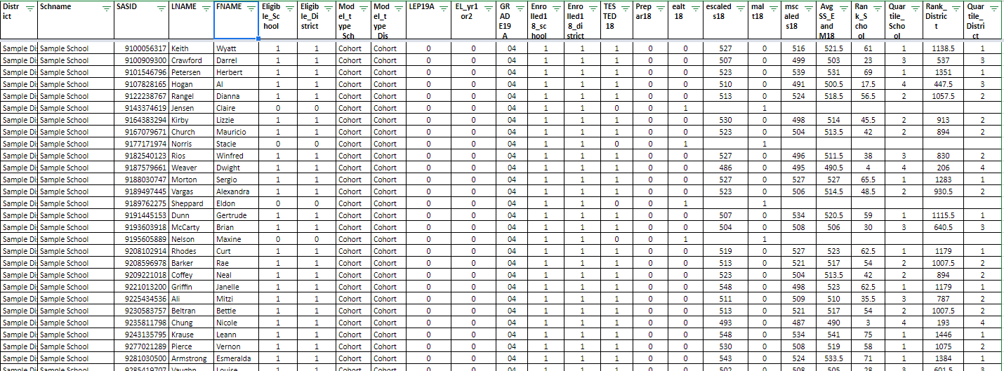

Bottom line: If you are using a Google Sheet as a data source, don't try to to make it look pretty! Spend some time ensuring your Sheet is set up to play nicely with Data Studio and it will make all the difference. A single header row with data underneath is all you need. 


Friday, April 17, 2020

Webinar: Getting Started with Google Data Studio in K-12 Education

With all of my workshops and conference presentations cancelled this spring I am really missing being able to share the joy of Google Data Studio with others! I am offering a free webinar (two date/time options) entitled "Getting Started with Google Data Studio in K-12 Education" which will be very similar to overview sessions I have presented at recent conferences. Feel free to share with colleagues too!

------------------------------

Google Data Studio, a free data visualization tool designed for business, can be used by educators to turn unwieldy data into visual and interactive dashboards. A variety of examples related to assessment, demographic, attendance, accountability, and other types of data will be presented. An overview of the steps to get started using this tool and create a simple dashboard will be shared. While this is not intended to be a hands-on session, some "getting started" resources will be provided so that participants can try out the tool on their own after the session.

Thursday, April 23, 2020, 10:00 am EST - 11:00 am EST 
Friday, April 24, 2020, 11:00 am EST - 12:00 pm EST
Tuesday, April 28, 2020, 4:00 pm EST - 5:00 pm EST

Instructor: Laura Tilton (http://tiltondata.blogspot.com, @tiltondata on Twitter)

Cost: Free!

Registration: https://forms.gle/idsxeMFDWcRQJEHw5

The session will be held via Zoom and the link will be emailed to registrants the day before the session. If you have any questions please contact me at tiltondata@gmail.com.

Thursday, April 16, 2020

Collecting and Viewing Student Check-In Data

Wow! I realized it's been almost a month since my last blog post. So many things happening in the world these days as we try to reinvent education as we know it! I know many educators/schools are looking to collect information from students (and their families) as they learn remotely. I have previously written about how Google Data Studio is a great tool for visualizing data that comes from Google Forms.

If a school needed to 'take attendance' during remote learning, they might do so with a "question of the day" setup like this one that I recently created. It could also be used as just a fun daily check-in to build community or engage students. This report embeds the Google Form, and an automatically updated Question of the Day (from a Google Sheet) right into the report, so it's a one stop shop for collecting and displaying information from students.


When used with the Filter by Email feature of Data Studio, the results of a student survey could be used to display information back to a student, similar to the way Matt Heusmann, ESU 6 in Nebraska, used three different forms (check-in, journaling, and exit ticket) to populate this sample Data Studio Report.


You might also choose to check in on how students are feeling, which you could do with a tool similar to the Personality Quiz example created by Michael Howe-Ely.


Other data collected and visualized during remote learning might be usage data from a district's Learning Management System or family surveys providing feedback on the remote learning process. Jordan Benedict has an interesting blog article on 4 Types of Data to Collect During Distance Learning...what information are you collecting? Do you have any other valuable resources on this topic? Please share here on the blog, connect with me on Twitter @tiltondata, or drop me a line at tiltondata@gmail.com. Hope you are well and staying safe and sane!

Thursday, February 20, 2020

A Whole New World for Google Form Data

Think about all the different ways we use Google Forms in education...assessments, exit tickets, surveys, RSVPs, logs, and more! Well, Google Forms feed Google Sheets. And Google Sheets feed Google Data Studio!

While Google Forms does have its own basic reporting tools (bar charts and pie graphs), if we attach the Google Sheet results of a Google Form to Google Data Studio, we can do so much more with the data! Not only in terms of visualizing the data, but also in terms of sharing the data. I want to present two examples that illustrate how amazing this can be.

First, an example from Craig Sheil who used Data Studio to visualize the results of a student survey about social media use at Bedford (NH) High School. In previous years, the results of the survey were shared with students via Google Slides (using screen shots of the graphs from the Form results). This year, the results were compiled into a Data Studio report, including some interactive filters, allowing for a dynamic exploration of the data.


The second example is based on work by Elissa Malespina who created a Google Data Studio report of student reading log data back in October of 2018 (while at Somerville Middle School in NJ). When I saw her example, I was really excited to see Data Studio being used with students (and amazed at how ahead of the times Elissa was!). However, I knew that some of the Data Studio updates since 2018 could really enhance what she had already started. I reached out and she agreed to share the (anonymized) data with me, so that I could update her report with some new features.


I've extended the example to illustrate how one data set could be used to display data to different audiences. The first page shows the school-level data, with lots of built-in interactive filters. The subsequent pages show classroom-level data and student-level data, which could be built with either report-level filters or using the new Filter By Email feature in Data Studio.

What Google Form data do you have that might lend itself to a Data Studio report? I'd love to find some more examples of student-submitted data to use to build reports! Or, if you've already built a report, please submit it to the K-12 Data Studio Report Collection!


Friday, February 14, 2020

Public K-12 Report Collection / Data Studio Filter by Email

I realized that it's been a few weeks since I posted an entry on the blog; mostly because I have been sharing small updates more regularly on Twitter. Please be sure to follow me @tiltondata for additional updates related to using data in support of teaching and learning, particularly with ideas related to the use of Google Data Studio!

Speaking of Data Studio, I have launched a new public K-12 Data Studio Report collection with entries from a number of districts and organizations nationwide. (I previously shared information about a collection of just my own reports, but wanted to expand this idea to a larger library.) I hope you'll check it out, and maybe even submit an entry of your own! http://bit.ly/k12datastudio

We received exciting news from the Google Development team yesterday, and that is the introduction of the Filter by Email feature in Data Studio. This feature provides "row-level" security to the data source that underlies the report, when the data source has a column/field that contains email addresses (one per row is currently supported). This means that we can create dashboards that will change based on WHO is logged in! Previously, the way to accomplish user-specific dashboards required using BigQuery as a data source and was a much more complex process, so this is a very welcome new feature!

You can read more about this new feature in the Google Help documentation here: https://support.google.com/datastudio/answer/9713766. 

I invite you to try out my very basic "proof of concept" dashboard which displays the data resulting from a Google Form in both a filtered and unfiltered way. (You will need to be logged into a Google account to access it.) I hope to share additional (more edu-specific) ideas and templates in the coming weeks.

Want to learn more about using Google Data Studio in support of teaching and learning? Check out the list of events below, or reach out if you'd like to host a workshop for your district or collaborative.

Thursday, January 23, 2020

In-Field and Out-of-Field Educator Designation Report

Over the past week, school districts in Massachusetts received information as to whether their teachers are designated as "in-field" or "out-of-field" for the courses they are teaching. Under new requirements under the Every Student Succeeds Act (ESSA), the Department of Elementary and Secondary Education annually summarizes this information and posts it in School and District Profiles and School and District Report Cards.

This information was delivered in an Excel spreadsheet to the DESE Security Portal > Drop Box Central > EPIMS File Exchange, and has the file name like In_field_data_2019_xxxxxxxx.xls. If you convert this file to a Google Sheet, you can use it as the data source for a simple report I've created to explore this data.

This report uses a pivot table as a filter, so that you can click anywhere in the summary table to filter the data. In the example below, I've clicked the "N" column for Sample1 School, and the list below updates to show the 6 educators who are Out-of-Field and why.


Feel free to check out the report template (which contains sample data), and follow the instructions to connect your own Google Sheet as the data source to create your own copy of the report. As always, please make sure the link sharing settings on your reports and data sources are are turned off, so that if you need to share the file you are sharing only with designated, authorized individuals.

--------------------------------------------------------

Upcoming Google Data Studio workshops:
2/11/2020 @ Southeastern Massachusetts Educational Collaborative (Dartmouth, MA)
3/31/2020 @ The Education Cooperative (Walpole, MA) 

Upcoming Conference presentations:
2/28/2020 @ METAA CTO Clinic (Milford, MA)
3/6/2020 @ MASCD and MassCUE Leadership Conference (Worcester, MA)
3/27/2020 @ Medfield Design Your Learning Day (Medfield, MA) 


Tuesday, January 14, 2020

Simple School or District Staff Directory Tool

Here's an idea for a simple Google Data Studio tool that your school or district may find useful! Not all staff members have access to the Staff module of your SIS (such as Aspen), so answering questions like, "Who are all the reading specialists in the district?" or "Who are the members of the math department?" or "What is Mrs. Smith's room number?" might not be all that easy to answer without asking a secretary or an administrator. Here's an example of a district/school directory using Google Data Studio. Users can search/filter by school, name, department, or job title, or sort by clicking the column headers.


Want your own version of this directory? This is a great project for anyone new to Google Data Studio.

First, create a data source by pulling the following fields from the Staff listing in your SIS and placing them in a Google Sheet (you don't need to share it). Make sure the column headers match this list exactly (feel free to make a copy of my sample data source to use as a template):
  • First
  • Last
  • Email
  • Ext
  • Room
  • Position
  • Department
  • School
Next, access the example above and click the Use Template button in the upper right corner of the screen. Follow these instructions to connect your Google Sheet to the report.

Finally, you need to decide who you would like to access your new report. Use the "Share" button to share as view-only with specific individuals, with everyone in your GSuite domain, or with anyone with the link. If this is a district or school directory, I would suggest sharing it with the domain, so that only members of your school or district will have access to the directory when they are logged into their school accounts.

As the editor of the report, you can then modify the color scheme to match your district's colors, add a logo or text, or make other modifications as desired. You can also embed the report into a web page for easy access.

You will need to manually update the Google Sheet on the "back end" periodically to make sure the report is up to date. I hope to be able to share in the near future a solution for automatically updating a Google Sheet from your SIS, so stay tuned!

--------------------------------------------------------

Upcoming Google Data Studio workshops:
  • 2/11/2020 @ Southeastern Massachusetts Educational Collaborative (Dartmouth, MA)
  • 3/31/2020 @ The Education Cooperative (Walpole, MA) not yet open for registration
  • 2/28/2020 @ METAA CTO Clinic (Milford, MA)
  • 3/27/2020 @ Medfield Design Your Learning Day (Medfield, MA) 
Lately, I have been tweeting more and blogging less, so please follow me on Twitter @tiltondata to stay in touch! As a reminder, you can find my complete Google Data Studio report catalog at http://bit.ly/tiltondata.