Wednesday, June 17, 2020

Fun with Filters!

One of the most valuable features of Data Studio for looking at education data is the ability to include filters which allow users to "slice and dice" the information on the screen to answer their own questions. However, there are several features within Data Studio that reference the term "filter" and so I thought I would write up some clarification plus a sample report, since it can get a little confusing.

Dimension Filter icon Filter Controls are elements that can be added to any Data Studio report, using the Filter Control button in the toolbar. The default Filter Control is a multi-select pop-up type, but it can be configured in the Style pane with a number of options. Filter Controls can be single-select or multi-select, can include a Search box, can be a pop-up or clickable type, and can include filter operators such as EQUALS or CONTAINS. Of course, color, font, and size are all customizeable as well.
Data Studio Help: Filter Controls

Chart Interaction Filters allow report authors to turn charts into interactive filters. For example, if your report contained a pie chart, this could be made into an interactive filter allowing the user to click a section of the pie chart to filter the information in the report.
Data Studio Help: Chart Interaction Filters
Treemap as filter menu from Mehdi Oudjida

Filters are a way to restrict the data appearing within a report or report element on the "back end." Filters themselves are not interactive (although you'll often hear people refer to a Filter Control as a Filter, hence the confusion.) For example, if you wanted to include a Scorecard element which showed a count of only the students who scored in a particular category, you could put a Filter on the Scorecard to include only those students, and the count would reflect it.
Data Studio Help: About Filters

Filter by Email is a relatively new feature of Data Studio that uses the user's Google account to display a custom data set based on an Email field in the data source.
Data Studio Help: Filter by email address

I created this sample report (also linked to the image above) to show examples of all the elements discussed here (except Filter by Email), so you can see how these different filters work. Obviously, you wouldn't use them all in one report for the same dimension, so this report is really just for fun.

Let me know.. how do YOU like to filter?


Thursday, June 4, 2020

Visualizing Plans for the Class of 2020

Many high schools publish a list of the plans of their graduates, but wouldn't it be fun to visualize this list on a map, to see where a school's students will disperse after graduation?

Here's a very simple template for any high school who wishes to display the plans of their 2020 graduates in a fun visual map format. Clicking on a row in the table will zoom in on the Google map to show the location, and the user can even use the "Pegman" to take a look around at Street View. Clicking the row again will bring the user back to the entire list/map.


To make your own version of this report, first create a simple Google Sheet with a single column with a header of "List." This column should have a single entry related to each student in the class, although the list would not include student names. So, for example, if two students are attending Cape Cod Community College, then "Cape Cod Community College" would appear twice in the first column of the spreadsheet. It doesn't matter what order the list is in. Most high school guidance departments would be able to export this list from Naviance or other college and career platform.

 After the Sheet is put together, you can make a copy of the report by clicking Use Template in the upper right corner of the report link. You can then connect your new Sheet as the data source for your copy of the report. If you need additional information about how to connect a report to a data source, please refer to these instructions.

You will want to check that the List field is of the type Geo > Address. You can check this through the Resource menu > Manage added data sources > Edit and check the Type column for the List field.

A few notes: Some Sheet entries may need to be tweaked to display correctly. For example, there may be multiple colleges with the same name (like Trinity College) so you may need to add a city/state in order for it to display correctly. Non-location generic entries such as "2yr college", "Employment," etc. will not display on the map but will display in the list.

You can then customize the colors, logos, etc. of the report to make it your own. (Tip: Try Extract Theme from Image using your school's logo!) I would love to see what you come up with - and congratulations to the class of 2020!

Wednesday, May 27, 2020

Create a Student Dropbox and Work Log with Google Tools

We have seen a number of examples where Google Data Studio has been used effectively to visualize and share data from a Google Form in multiple ways. Since Google Forms can capture the email address of the person filling out the form, the Filter by Email feature of Data Studio can be used to create a customized report with only the information that person submitted. Data Studio could also be used to display the same data for the teacher, or even for the public (if appropriate).
With remote learning happening in school districts all over the world, schools have taken advantage of technology tools to facilitate the delivery of learning materials and collection of student work. Many districts use Google Classroom or other Learning Management Systems to facilitate this process, but there may be situations where a teacher or school would want to collect and share student work in a different way.

I only recently learned (within the past year) that Google Forms has a File Upload question type, which requires the person filling out the form to be logged in to Google. It then places the uploaded files in a dedicated folder on the Form owner's Google Drive, and adds a column in the Form's Google Sheet results of links to each submitted file. Many folks have used Google Forms as a "drop box" of sorts since this feature was released. 

I started thinking about how we might use the File Upload/dropbox approach to Google Forms with Data Studio, especially if we were asking students to share materials that were visual images. I put together a sample Form which asks students to upload a picture based on a weekly assignment. We can then think about displaying the student-submitted responses and files in a variety of ways in Data Studio, but all with the same data source (the Form Sheet.)
  • A student-specific work log, which allows a student to view only his or her responses and submitted work, like a portfolio of sorts. 
  • A teacher- or class-specific work log, which allows the teacher to look at responses/work by student OR by assignment.
  • A public display of student work, which might display images and descriptions, either with or without student names. 
Here's the example Data Studio Report for your exploration. Each page of the report shows a different version of the report (in actuality they would be separate report files), but all use the SAME data source.


Please read through the About notes on the report itself for some of the trickier things about putting this one together. Let me know if you want to give this a try yourself - I'm happy to help!

Friday, May 15, 2020

Google Maps in Data Studio

For a while now, Data Studio has had the ability to visualize data in map form. However, recently this feature was upgraded to be able to display "geo" data in Google Maps within a report. Geo data is essentially just data that represents a street address, city, country, etc. 

I had previously created a travel log report for a family member, which allowed them to update a Google Sheet with different locations they had visited, and it marked them on a map in the report. (Yes, I sometimes create reports for fun. Don't judge.) The travel log allows filtering by year, trip name, or trip operator, and I updated it to include the Google Maps functionality when it became available. Now, the map narrows in on an area of the globe when a trip is selected AND allows the user to zoom to street view and look around. Not education data, I know, but a fun way to revisit past trips until we can travel again. Check out a sample copy here (including directions to make your own). 


I started wondering if there were ways a report using this feature could become part of a student learning activity. I played around with exploring map data of Civil War battles using data I found online, but didn't get too far with it. I ended up creating a Massachusetts Cities and Towns report (based on Wikipedia entries) that allows the user to explore information like population, government type, county, and town seal. 


While I did create the data source for this report myself, I realized that it could just have easily been created by students submitting data via a Google Form. Wouldn't that be fantastic? Say your third grade has 350-ish students, and you ask them each to research one of 351 Massachusetts cities or towns, gathering population, government type, county, and a link to the town seal. Students put their findings into a Google Form, which results in a Sheet that becomes the source for a report like this one!

I would LOVE to hear some other ideas for learning activities like this, where data is collected by students, submitted via a form and then displayed on a map. If you've got an idea, I'll help you pull it off!

Google Maps in GDS: Examples and Resources


Wednesday, April 29, 2020

Do You Hear the Angels Sing?

Thank you for all the interest in my recent "Getting Started with Google Data Studio" webinars. Between the three sessions, there were over 150 participants from all over the US and the world! As I told those that attended, the first time I saw Data Studio in action, I heard angels singing! My hope in offering these webinars was to help you all hear the angels sing too.

As promised, I am sharing the recorded webinar, the 'slide deck' (actually a GDS report), and the list of getting started resources, for those who would like to review the materials or share with colleagues. Additional resources are regularly posted here on my blog as well as on Twitter @tiltondata. I am also available to provide consulting services in the area of Data Studio professional development as well as customized dashboard development.

Please feel free to reach out if you have follow-up questions, resources to share, ideas for new visualization tools, or suggestions for future blog posts.  Thank you and stay well!

Tuesday, April 21, 2020

Tips for Structuring Your GDS Data Source in Google Sheets

When educators are first getting started with Google Data Studio, one of the most challenging things to learn is the best way to structure a data source (for example, in Sheets) so that it works well with Data Studio. The problem is that the way people tend to USE spreadsheets can be very different than the way Data Studio prefers them to be set up in order to visualize the data effectively.

Here's a simple example. Schools often store data within a structure like the one below, because it makes more sense when we are looking at it in a spreadsheet. We can look at and/or enter student scores over time, and we can see all of a single student's data in one row. Logical, right?


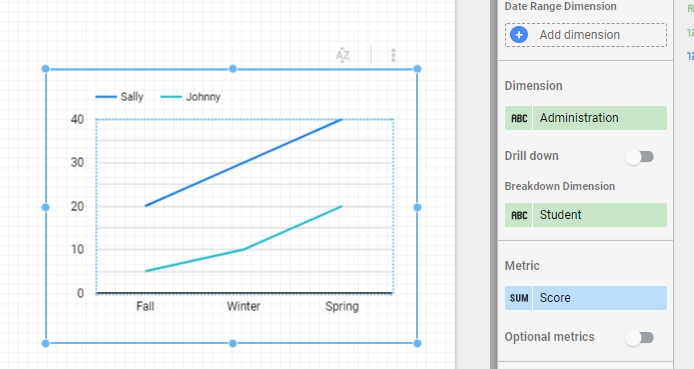
However, this type of structure may not allow us to display the data in a desired format, because you essentially have three sets of metrics for each student. Restructuring the data so that we have a dimension (Administration) and a metric (Score) can help, as in the example below.


This allows us to graph the data in a useful way:


I see a lot of Sheets where there is one tab (or Sheet) per school, grade level, classroom, etc. Data Studio wants to see your data in a single Sheet, with columns to identify school, grade level, classroom, etc. which will then allow you to filter the data by those criteria. You can use an IMPORTRANGE or QUERY formula to bring data together from multiple tabs or Sheets. 


A few other tips for structuring data sources:
  • If you're concerned your existing data needs some restructuring in order to work well with Data Studio, you can try taking a look at Ben Collins' approach for 'unpivoting' data in Sheets
  • Life is easier if your data source Sheet has a single header row in the first row of the Sheet. Merged cells or multi-row headers will need cleanup or workarounds in order to use them in Data Studio. 
  • Avoid summary rows, extra text on the sheet, and blank rows or columns (blank columns will not be brought as part of a data source even if they have a header). 
  • Cells should contain a single value where possible. I try to avoid 'check all that apply' type questions in a Google Form for this reason. I found this resource on CATA questions from Sheila B. Robinson very helpful. 
  • If you will want to do any sort of data blending with multiple sources, make sure your Sheet includes a column with some sort of unique identifier, such as student ID number.
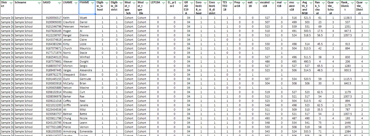
Many of the CSV files we get from DESE here in Massachusetts work really well with Data Studio just the way they are. (Note: I always bring CSV files into Sheets rather than using the 'Upload CSV' data connector.) Raw exports from a district's student information system or assessment database also tend to work very well, even though they might be a challenge to wrap our heads around visually. Spreadsheets such as the one below are ugly, but Data Studio loves them!


Bottom line: If you are using a Google Sheet as a data source, don't try to to make it look pretty! Spend some time ensuring your Sheet is set up to play nicely with Data Studio and it will make all the difference. A single header row with data underneath is all you need. 


Friday, April 17, 2020

Webinar: Getting Started with Google Data Studio in K-12 Education

With all of my workshops and conference presentations cancelled this spring I am really missing being able to share the joy of Google Data Studio with others! I am offering a free webinar (two date/time options) entitled "Getting Started with Google Data Studio in K-12 Education" which will be very similar to overview sessions I have presented at recent conferences. Feel free to share with colleagues too!

------------------------------

Google Data Studio, a free data visualization tool designed for business, can be used by educators to turn unwieldy data into visual and interactive dashboards. A variety of examples related to assessment, demographic, attendance, accountability, and other types of data will be presented. An overview of the steps to get started using this tool and create a simple dashboard will be shared. While this is not intended to be a hands-on session, some "getting started" resources will be provided so that participants can try out the tool on their own after the session.

Thursday, April 23, 2020, 10:00 am EST - 11:00 am EST 
Friday, April 24, 2020, 11:00 am EST - 12:00 pm EST
Tuesday, April 28, 2020, 4:00 pm EST - 5:00 pm EST

Instructor: Laura Tilton (http://tiltondata.blogspot.com, @tiltondata on Twitter)

Cost: Free!

Registration: https://forms.gle/idsxeMFDWcRQJEHw5

The session will be held via Zoom and the link will be emailed to registrants the day before the session. If you have any questions please contact me at tiltondata@gmail.com.